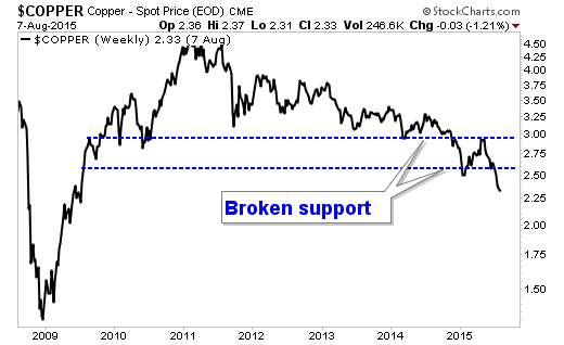
I've written a column for Energy & Resource Digest about copper. As you can see the, chart of copper looks broken.
(Updated chart)
They call this metal "Doctor Copper" because it takes the temperature of the global economy. In my article for Energy & Resource Digest, I explain why this is more of a localized flu, and not a problem infecting the world.
I'll link to the article when it goes live.
(Updated chart)
They call this metal "Doctor Copper" because it takes the temperature of the global economy. In my article for Energy & Resource Digest, I explain why this is more of a localized flu, and not a problem infecting the world.
I'll link to the article when it goes live.
No comments:
Post a Comment